Wednesday, June 30, 2010

Liu Wen on Magazine Cover for L'Officiel China, June 2010

Model: Liu Wen (Marilyn)
Magazine Cover: L'Officiel China, June 2010
Photographer: Unknown

Source: tentalicious @ tfs

Tuesday, June 29, 2010

No-Sew Collage Placemats

When I have a bad day or seven in the studio, I like to retreat for a while into things that are artsy, fun and uncomplicated. There's nothing like guaranteed success to raise your spirits!

With summer upon us, and the 4th of July right around the corner, many of us are eating outside on picnic tables and on blankets stretched out in our favorite parks. A set of bright, colorful placemats are handy to have on hand, and these are simple to make, reversible, and wipe clean with a damp cloth.


What You'll Need:

~ 4-6 sheets of heavy watercolor paper (use as many sheets of paper as the number of placemats you'd like to make) about 140# or better, cut to size (see "What You'll Do" for further instructions on sizing.)
~ Craft paints in 3-4 coordinating colors and 1 in a bright, contrasting color
~ Foam craft brushes or sponges
~ Clear Contact Paper (clear or frosted vinyl sheeting which is sticky on one side. The sticky side is protected by a piece of release paper which needs to be peeled off to use the contact paper.)
~ Paper trimmer, scissors or rotary cutter
~ Cutting mat
~ Bone folder (optional.)


What You'll Do:

~ Prepare your contact paper by cutting pieces to the size you'd like for your final placemats, two pieces per placemat (one for the front, and one for the back.) I like to make them about 16"- 18" long by 14" wide. This allows plenty of room for a 12" plate, cutlery and a drinking glass. Set aside.
~  Prepare your paper. Trim the paper so that it is 1/4" smaller all the way around than the contact paper sheets you've already cut. Paint one side of each paper in your chosen contrasting color.


~Once dry, flip the papers over and smear the remaining colors and some of the contrasting color on each sheet of paper. You can be sloppy with this- you're not making art, you're only freely applying paint in splotches and streaks. Let the paint mix on the paper, but don't overmix or you could produce muddied, dull colors. Set all papers aside to dry.


~ Once your papers have dried, cut them into strips between 1/2" and 3/4", whatever your preference.


~ To construct your placemats, peel about 2" of the release paper off one of the short edges of your prepared contact paper, line the cut edge up with a cutting line on your mat, sticky side UP, and carefully place one strip of painted paper about 1/4" in from the edge. Once you've lined up the first strip of paper, you should be able to butt the edge of the next strip against the first, and so on, to get straight, even spacing across the length of the placemat. You want to be sure to leave a margin of contact paper about 1/4" on all four sides.


~ Continue placing strips, peeling back only a few inches of the release paper at a time to keep it from picking up dust and finger prints. Now and then, flip one of the strips over to reveal the contrasting color and apply it to the contact paper. Place strips along the entire length of your contact paper sheet until you reach the other edge, leaving about 1/4" of contact paper on the very edge without any paper.
~ Using a second piece of your pre-cut contact paper, peel the release paper off of about 2" on the short edge, and line up that edge with the edge of the contact paper to which you've applied the paper strips, sticky side facing the paper. Carefully press into place on top of the paper strips, lining up the edges of both pieces of contact paper with one another. Smooth the contact paper down, sealing the paper strips in between, a few inches at a time, peeling back the contact paper as needed until you reach the other edge.
~ Using a bone folder (putty knife, your hands, whatever you have), buff each side of the placemat to be sure each is firmly adhered to the paper and each other, being sure not to trap any air bubbles.
~ If the edges of the contact papers don't exactly meet, you can trim them down now (aren't you glad you left yourself that 1/4" margin all the way around?)
~ When they're complete, they should look somehting like this on the front...


... and like this on the back.


~ Each placemat is made in the same way.

Tips And Hints

~ Contact paper can be repositioned! If you make a mistake in placement, carefully peel the contact paper back and reposition it. 
~ Why just use strips? Collage large, small, or oddly shaped pieces of paper  and paper ephemera all over the contact paper and then cover with a second sheet of contact paper in the manner described above.
~ For the holidays, make placemats using metallic paints for sparkle.
~ Why just use paper? This works beautifully with fabric, as well, though the placemats will be a little floppier than if they're made with paper.


~ Even ugly fabric can be collaged into something attractive and useful!
~ Why just use paper or fabric? You can trap nearly anything between two pieces of contact paper... fibers, quilting blocks, glitter, dried flowers, photograps; the possibilities are endless!

I hope if you make these neat little placemats that you'll come back and post a link to show them off to all of us!! Happy creating, and if you're in the U.S., Happy 4th of July!

Emma Pei in Editorial for L'Officiel China, July 2010

Emma Pei has been keeping a fairly low profile since the beginning of the year. I think she is absolutely gorgeous and am ecstatic to see her back with a great new editorial in the July 2010 issue of L'Officiel China.

Model: Emma Pei (IMG)
Editorial: Unknown
Magazine: L'Officiel China, July 2010
Photographer: Juan Zi

Source: Fashionising

Monday, June 28, 2010

Flutter

Butterflies
Happy Monday to all! And thank you so much for the Fimo birdie love :)
Congratulations to Allyson Haskell for winning the giveaway at my Facebook page!

Jihae Kim in Editorial for O, The Oprah Magazine, July 2010

Model: Jihae Kim (Wilhelmina)
Editorial: Up, Up & Away
Magazine: O, The Oprah Magazine, July 2010
Photographer: Gentl & Hyers
Stylist: Agnes Cammock
Hair: Patrick Melville
Makeup: Paco Blancas
Manicure: Roseann Singleton

Source: zinio.com

Sunday, June 27, 2010

Three little fimo birds

Three little fimo birds
From above
Mobile
1
2
3
4
All done! I painted them with acrylic & a coat of matte varnish.
It's Daniel's now because he asked me for it...how could I say no to Daniel :)
He wants to put it on the window above his desk in the new house.

Saturday, June 26, 2010

Clay Birdies WIP

Polymer Clay Birds wip
I cooked these little polymer clay birds this morning to be made into a mobile after I've painted them with acrylics. I'll show you the end result tomorrow.
The biggest one is 3 1/2 inches long from beak to tail.

Vintage: Ling Tan in Editorial for US Harper's Bazaar, 1997

Models: Ling Tan (IMG) & Others
Editorial: Unknown
Magazine: US Harper's Bazaar, 1997
Photographer: Patrick Demarchelier

Friday, June 25, 2010

The Ugly Truth

Since I started this blog to talk about how and why I do what I do, unvarnished and with all my bumps and bruises showing, I'm committed to telling you about the mistakes I make, too, and showing you the results of those mistakes.

It's been a long week. I started out all happy and shiny, and as I sit here and type this morning, I'm ready to set a match to the wet studio and take up stamp collecting.

So, let's get started.

This piece...


... started life as a 3 yard length of black cotton. I batiked it with soy wax and then discharged it with bleach. So far, so good. I had soaked it in vinegar to neutralize the bleach, then decided after the final rinse-out that I would go ahead and use anti-chlor, too. By the time it had been through the wash after the anti-chlor, the rusty-yellow color was pretty faded, so I gave it an over-dye in carmine red and chocolate brown.


It was a crappy dye job. The carmine red did fine and gave the piece a darker value, but the brown collected mostly at the edges of the fabric in big, ugly splotches.

In order to try and save the piece and bring some unity to it, I decided to screen a pattern all over it.

I created a stencil on one of my screens using strips of clear contact paper.


Then I thickened up some brown rose dye and went to town with it all over the fabric.


I loved, loved, loved the look that screen gave me, and will very likely repeat the same kind of pattern again on future screens.

Only now, I can't get the alginate out. It's stuck in there but good. 

Last week I charged the rest of my screens with thickened dyes to do some deconstructed screen printing this week. For two of the screens, I chose the three cool primaries- lemon yellow, magenta and turquoise- willing to risk the possibility of making mud in the hopes of getting great color mixtures. The third screen was charged with a combination of yellow and brown dyes.

To prepare these screens, I used a technique suggested in the book, Breakdown Printing: New Dimensions for Texture and Colour by Claire Benn and Leslie Morgan. I poured the thickened dyes on top of the screen in puddles and then settled items down into the puddles to give the final screen some texture.


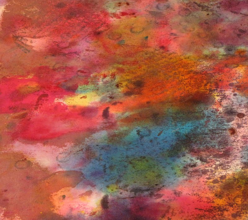
This is the project that contained the most mistakes and has yielded fabric that will need a LOT of aftercare (overdyeing, stamping, etc). Here it is at the moment, sitting in a bucket of rinse water while it waits for a different fabric to come out of the washing machine. Most of the dye has washed out, despite the fabric being soda-soaked previously. It now looks for all the world like a dropcloth.


My first mistake was, I think, getting the dyes too thick. As I was deconstructing them onto the fabric, the screens seemed to become glued to the fabric. I had to really yank at them to get them off and the thick puddles of dye often came off the screens and stuck to the fabric in large chunks. I was having such a hard time and was getting so discouraged, that I totally forgot to take pictures of the process. I fully intended to but only remembered after the fabric was already bundled in plastic to batch.

My next mistake was in using some sketchy items on the screens for texture. The idea is to use materials that will lift right off of the screen once it's dried- plastics, mostly. But instead of sticking strictly with plastics, I tried using some vinyl wallpaper scraps. They had fabulous texture on one side, but were paper-backed. Once the screens had dried, the papers behaved as if they'd been welded to the screens, and peeling them off was nearly impossible. I had also tried a scrunched up piece of wax paper for texture. Wow. I have no idea what the chemical reaction was, but the alginate broke down the paper and turned it into a slimy, stringy mess that I never was able to remove before screening.

My final mistake- and this one could have been a real screen-destroyer but fortunately wasn't- I got tired of waiting for the screens to dry so I put them outside in a shady spot. Of course, the sun actually moves, doesn't it? By the time I brought them back into the house, they had been sitting in the sun for hours and the dyes had baked onto them.

I think it's time to take a live class in breakdown printing, because there's something I'm missing and it's giving me less-than-fun results more often than not.

The next oops is hanging on the line right now. It started out well enough, with a nice, simple batik pattern and some yellow dye.


It got another layer of batik and dye, this time in two shades of red.


I should have quit while I was ahead, and seriously thought about it, but what kind of artist am I if I won't take chances? So it got one more layer of batiking and another dye bath. In Gawd-Awful Retro Brown.


The 70's called, they want their curtains back. And yes, you're seeing that right- only half of it is speckled... the fabric had been folded and the wax I'd dripped onto it didn't go through both layers. This is an excellent candidate for discharge, or for lining the cat pan, I haven't decided which, yet. I'd be slamming my head on the desk right now, if I didn't already have a scorching headache.

It looks as if the only survivor out of the studio this week (and I can't count myself in that number), is this unassuming length of fabric.


It's hard to tell by this photo, but this fabric has been stamped many times with many different stamps (all hand-made, of course) in multiple colors of textile paint.


I used textile paints because I wanted to create a resist for the paint that would follow as I stain the background. Like this:


It's coming along nicely and will probably sit on my table for a few days while I tinker with it.

And finally, am I the only crazy person who looks at her dropcloth (that's been hard-used for a couple of years) and sees the potential for art?


Happy stamp collecting!

Hyun Yi Lee in Editorial for Vogue Korea, June 2010

Model: Hyun Yi Lee (Major)
Editorial: Blank Beauty
Magazine: Vogue Korea, June 2010
Photographer: Eoh Sang Sun

Source: Rosalinde @ tfs